In the vibrant world of UX design, colors wield immense power, shaping user experiences in profound ways. By understanding the psychology behind each hue, designers can strategically utilize colors to evoke emotions, guide interactions, and foster memorable engagements. Every shade holds the potential to captivate audiences and elevate digital experiences, making color psychology a vital tool for crafting compelling designs that resonate with users.
Let’s Talk Color Psychology
Imagine flipping through a greeting card, and the warm hues instantly bring a smile to your face. Now, recall visiting a website where the colors felt so inviting that you couldn’t resist delving deeper into what it had to offer. On the flip side, perhaps you’ve encountered cluttered websites or apps with chaotic color schemes that left you itching to exit as soon as you entered. It’s not just you—everyone’s mood can be influenced by the visual appeal of a design, whether it’s digital or physical. In UI design, the choice of color palette for elements like buttons or calls to action can profoundly shape user behavior and overall experience. UI designers need to grasp users’ perceptions and leverage them to craft meaningful interactions.

Feeling the Vibes: Color Associations
Let’s break each color by how they make us feel:
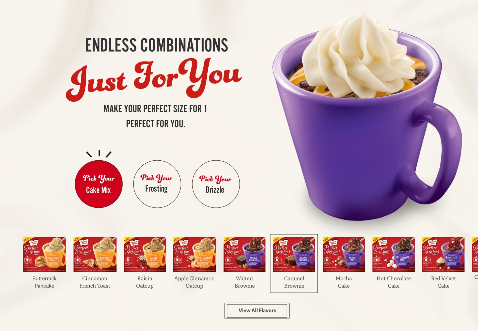
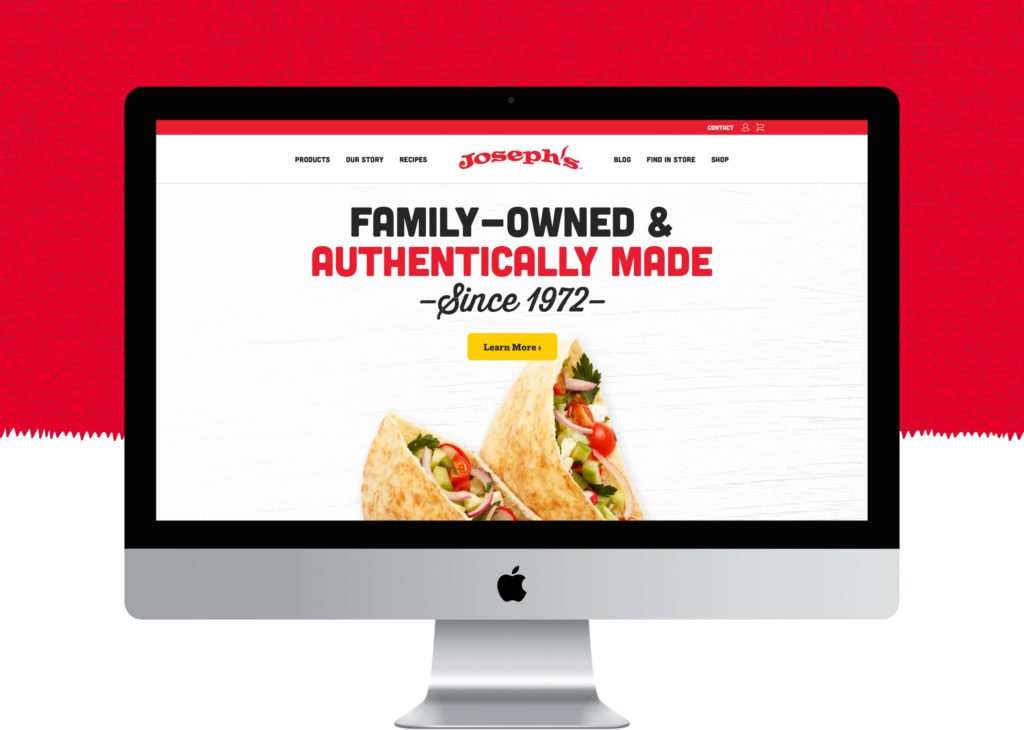
- Red: Think passion, urgency, and a bit of danger. It’s like the adrenaline rush of the color world.
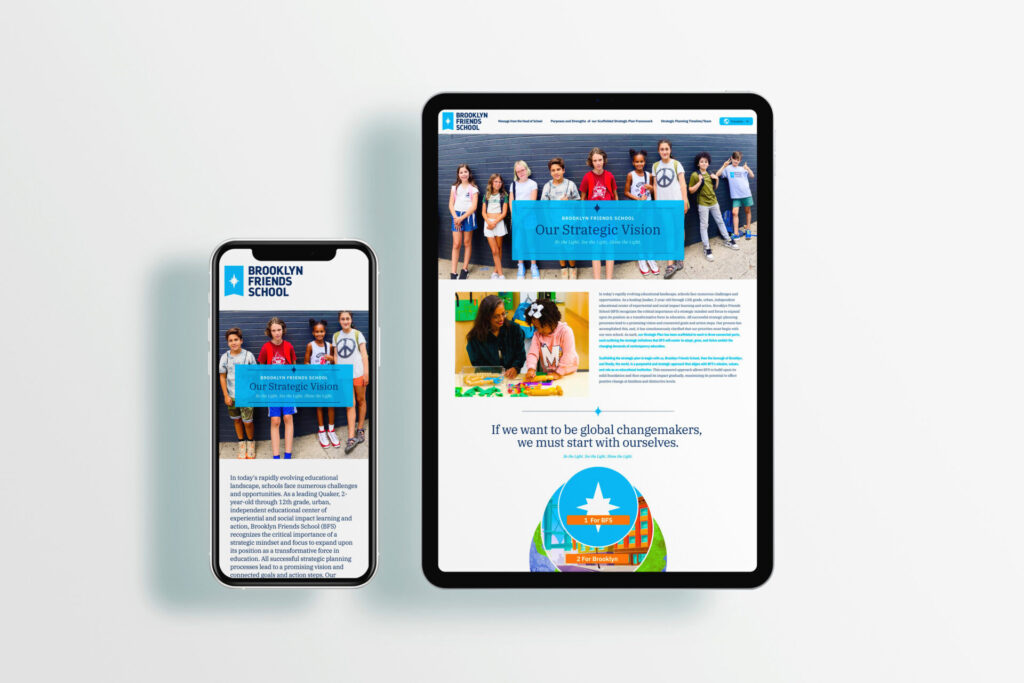
- Blue: Ah, the color of trust and tranquility. Like a calming ocean breeze on a hot day.
- Yellow: Ever noticed how yellow just screams “Hey, look at me!”? It’s all about optimism and energy.
- Green: From nature’s embrace to financial prosperity, green covers it all.
- Orange: The color of enthusiasm and creativity. It’s like a burst of sunshine on a rainy day.
- Purple: Royalty, luxury, and a touch of mystique—purple’s got it all.
- Black: Sleek, elegant, and a tad mysterious. It’s the James Bond of colors.
- White: Clean, simple, and oh-so-fresh. Like a blank canvas ready for your masterpiece.
Putting It into Practice: Design Tips
Now that we understand some of the underlying ways colors can influence us let’s talk about how to use them like a pro:
Stick to the Brand Guidelines
The first rule of thumb is to stick to the guidelines already laid out. You know, those brand and style guides? They’re like the holy grail for designers working with organizations. Companies usually have their own set of colors they’re married to, and it’s crucial for designers to stay faithful to these hues. It’s all about maintaining that important brand identity.
The 60-30-10 Rule
With the 60-30-10 Rule, you start with one main color, something chill like a neutral shade, which takes up a whopping 60% of your palette. Then, you throw in another color that complements it, filling up 30% of the space. And finally, you sprinkle in a dash of accent color, just 10%, to really make those elements stand out.

Visual Hierarchy
Going hand in hand with the 60-30-10 rule, is using visual hierarchy to direct users’ eyes through the design with the strategic placement of colors. Whether it’s a vibrant call-to-action button or a subtle accent color leading the way, strategic color placement ensures that users navigate through the design intuitively, resulting in a seamless and engaging user experience.
Accessibility Matters
Once you have your colors in place, don’t forget about people with visual impairments too. Be sure to check your color contrasts to make sure all of your text is legible. There are various tools and plugins to help with this depending on what software you’re using to design with.
Wrapping It Up
So, next time you’re crafting that killer website or app, remember the power of colors. They’re not just pretty pixels—they’re the key to unlocking unforgettable user experiences. Interested in how we might help your brand stand out? Let’s talk!
