Having a well-designed website is crucial for any business or individual aiming to establish a strong online presence. Your website serves as the virtual face of your brand, making it essential to create a user-friendly and visually appealing platform that effectively communicates your message. To help you navigate the intricacies of website design, we’ve compiled a list of do’s and don’ts that will guide you toward building a winning online presence.
Do’s
Prioritize User Experience (UX)
A user-friendly website is the foundation of success. Optimize your website’s navigation, ensuring visitors can easily find the information they’re looking for. Make use of intuitive menus, clear headings, and a logical page hierarchy to enhance UX.
Mobile Responsiveness
With the increasing use of smartphones and tablets, it’s vital to have a website that seamlessly adapts to various screen sizes. Implement a responsive design that guarantees a consistent user experience across all devices.

Clear and Concise Messaging
Visitors should be able to understand your brand and offerings within seconds of landing on your website. Craft clear and concise messaging that conveys your unique value proposition effectively. Use compelling headlines, subheadings, and concise paragraphs to communicate your message succinctly.
Visual Appeal
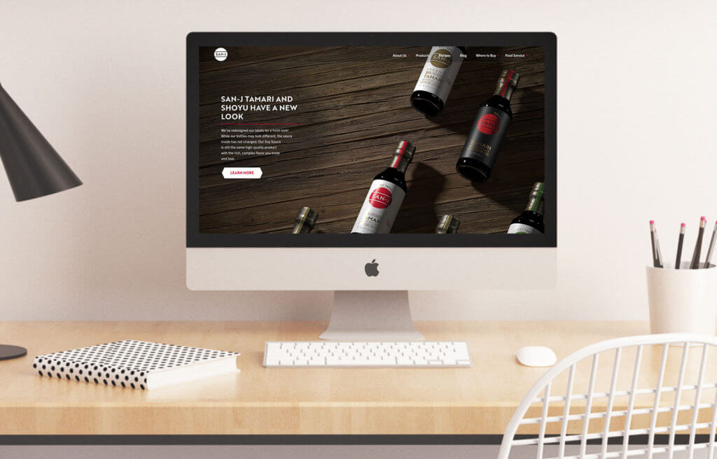
Invest in visually engaging design elements that align with your brand identity. Utilize high-quality images, videos, and graphics that enhance the overall aesthetic appeal of your website. Remember, a visually appealing website creates a positive first impression and encourages users to explore further.
Speed Optimization
Slow-loading websites frustrate visitors and negatively impact user experience. Optimize your website’s loading speed by compressing images, minifying code, and utilizing caching techniques. A fast-loading website not only improves user experience but also positively affects search engine rankings.
Don’ts
Cluttered Layout
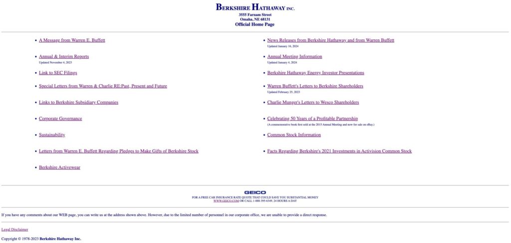
Avoid cluttered layouts that overwhelm visitors with too much information. Maintain a clean and organized design that allows users to focus on the essential elements of your website. Strategic use of white space can improve readability and enhance the overall user experience.
Excessive Pop-ups and Advertisements
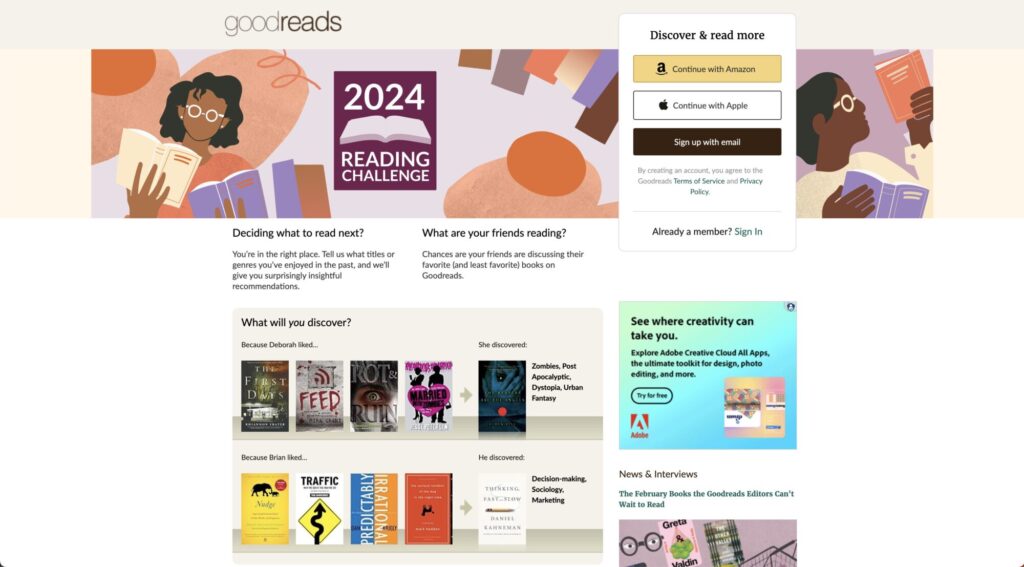
While pop-ups and advertisements can be effective marketing tools, excessive use can irritate visitors and deter them from engaging with your content. Implement these elements sparingly and ensure they don’t disrupt the user’s browsing experience.
Poor Color Choices
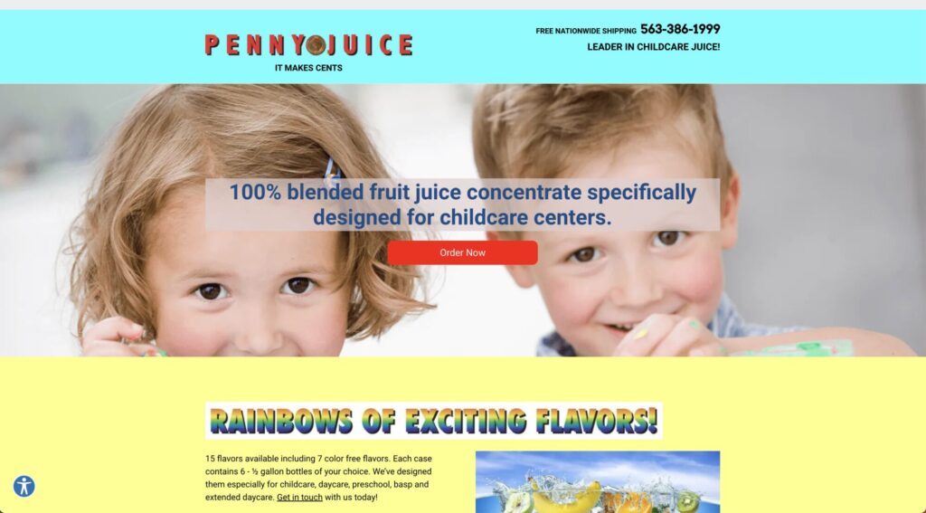
Colors play a significant role in conveying emotions and shaping brand perception. Avoid using clashing or jarring color combinations that strain the user’s eyes or create a negative impression. Select a color palette that complements your brand identity and evokes the desired emotions.
Complex Forms
Lengthy and complicated forms can discourage visitors from completing them, resulting in missed opportunities for lead generation. Keep your forms simple, concise, and easy to fill out. Only ask for essential information to minimize friction and increase conversion rates.
Lack of Call-to-Action (CTA)
A strong CTA guides users toward desired actions and improves website conversion rates. Ensure that each page of your website has a clear and prominent CTA, guiding visitors to take the next step, whether it’s making a purchase, subscribing to a newsletter, or contacting you for more information.
In Conclusion
By adhering to these website design do’s and don’ts, you can create a compelling online presence that captivates visitors, encourages engagement, and drives conversions. Remember, your website is a powerful tool for establishing credibility, building relationships, and growing your business. So invest the time and effort to ensure it accurately reflects your brand and delivers an exceptional user experience.
If you’d like some help with your website let us know!