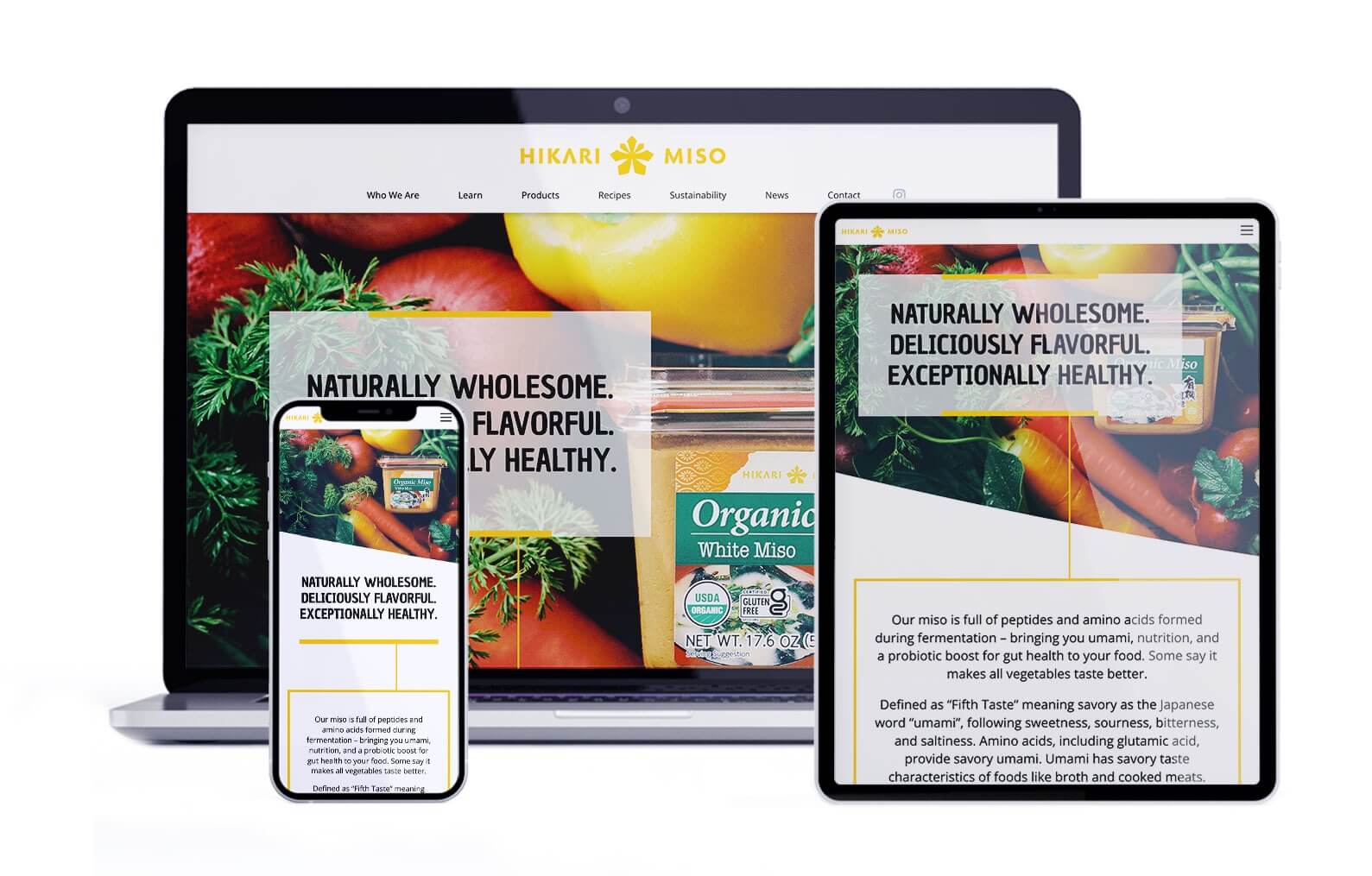
Hikari Miso
The Challenge
In order to enhance brand recognition in the U.S., Hikari Miso embarked on a mission to revamp their existing English website. The primary goal was to captivate visitors, encouraging them to delve into the world of miso and ultimately buy Hikari Miso products.
Bite-sized Content
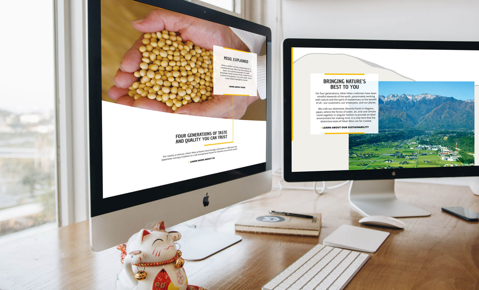
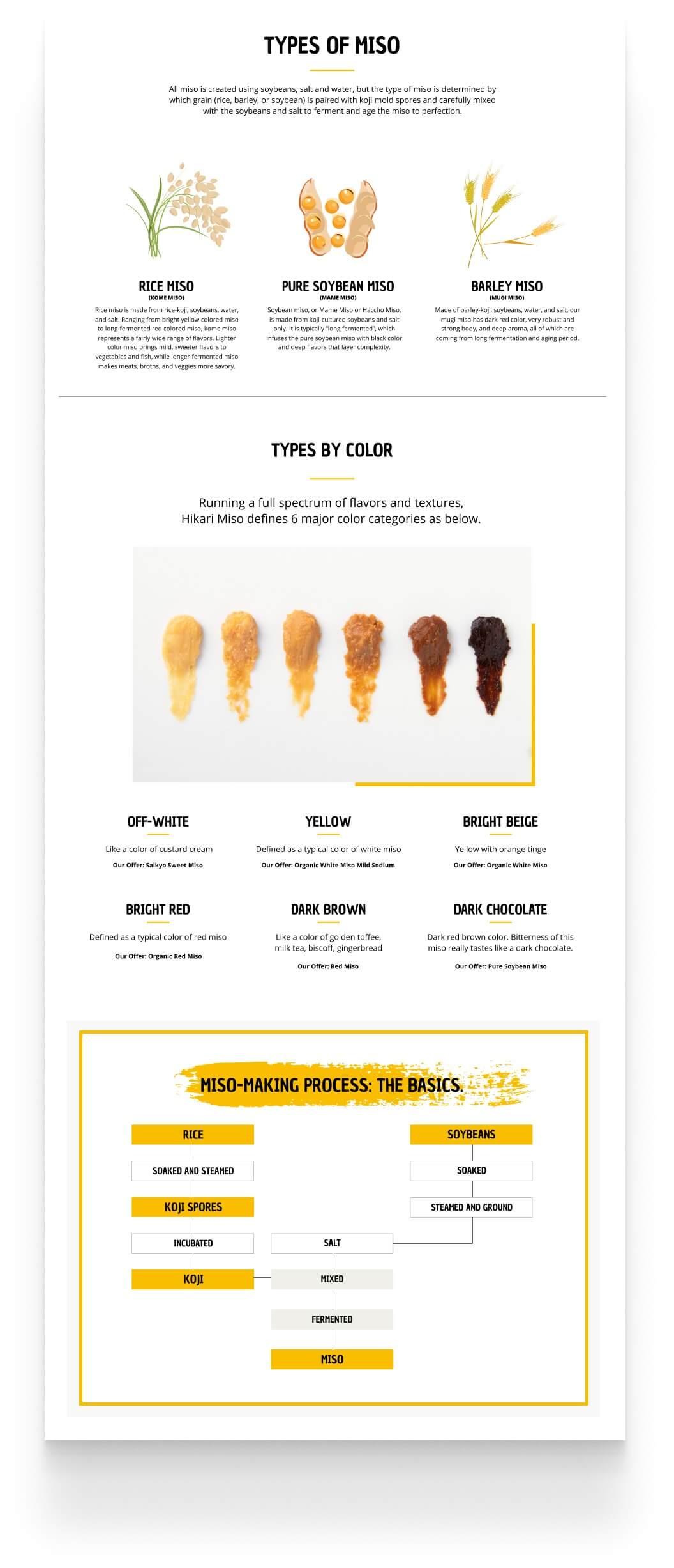
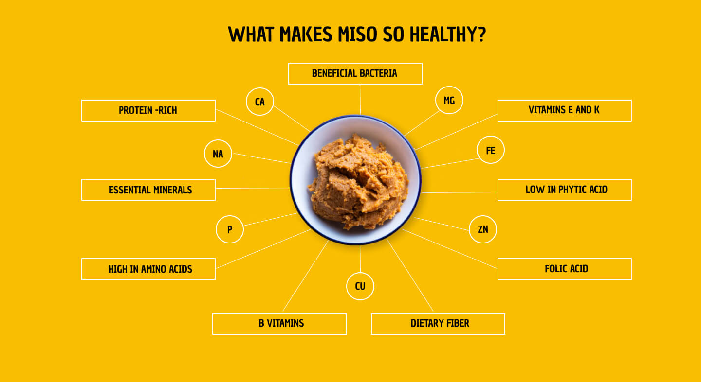
Like many of our clients, Hikari Miso had a wealth of valuable information about their products and company, but didn't have a website to showcase it. We worked with them to structure the site into bite-sized, easily digestible chunks that are visually pleasing, concise, and quickly comprehensible.
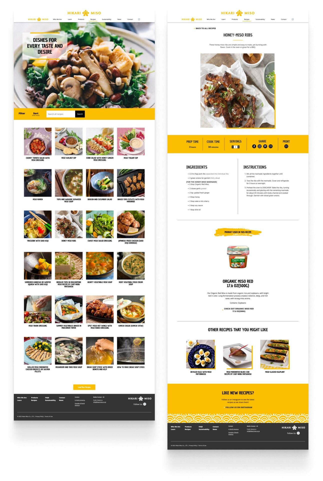
A robust and user-friendly recipe section
Educating the U.S. consumer to better understand the product
Ensuring the design's visual appeal across all devices is a priority
