The Challenge
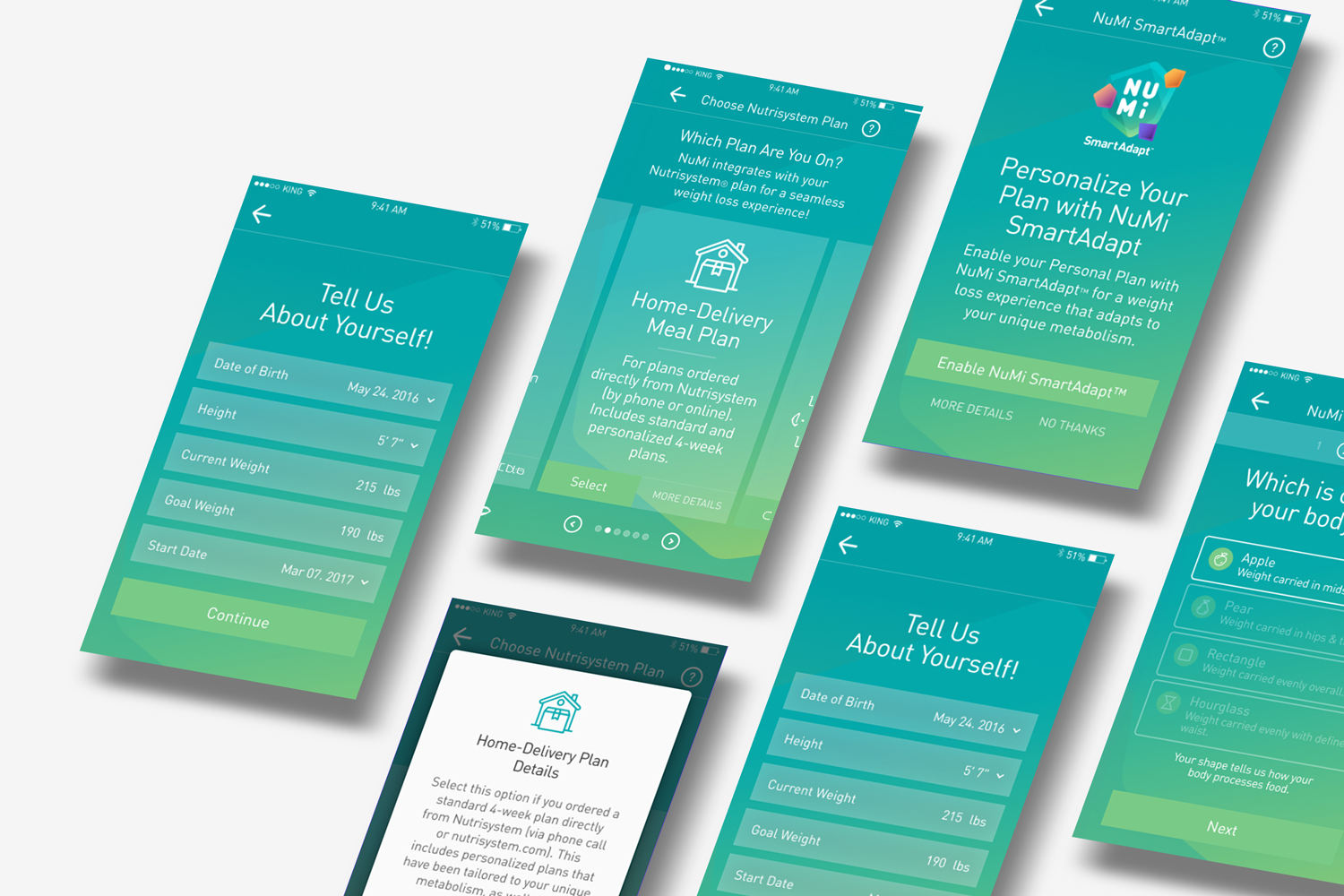
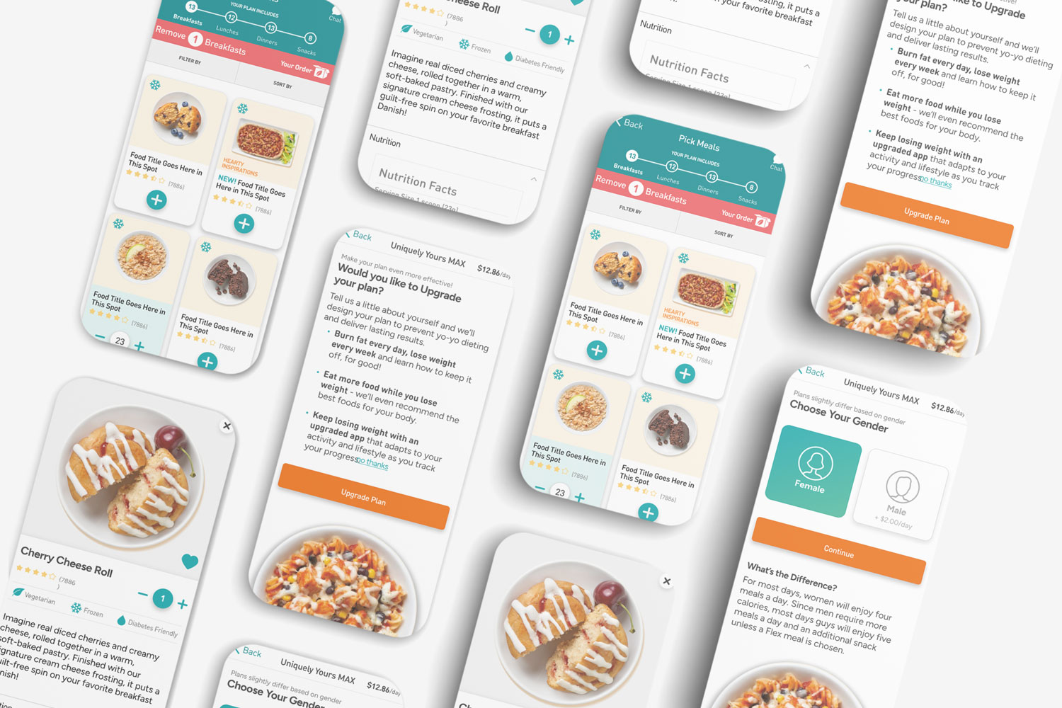
Nutrisystem enlisted our expertise to address concerns with their Numi app. Dissatisfied with the current state of the account creation and onboarding process, they sought to elevate the overall user experience and focus on personalization. The primary objectives involved; refining the plan selection, introducing a new "personal plan" option, seamlessly integrating a "personalization quiz," and extending these enhancements to the "change plan/restart plan" user flow.
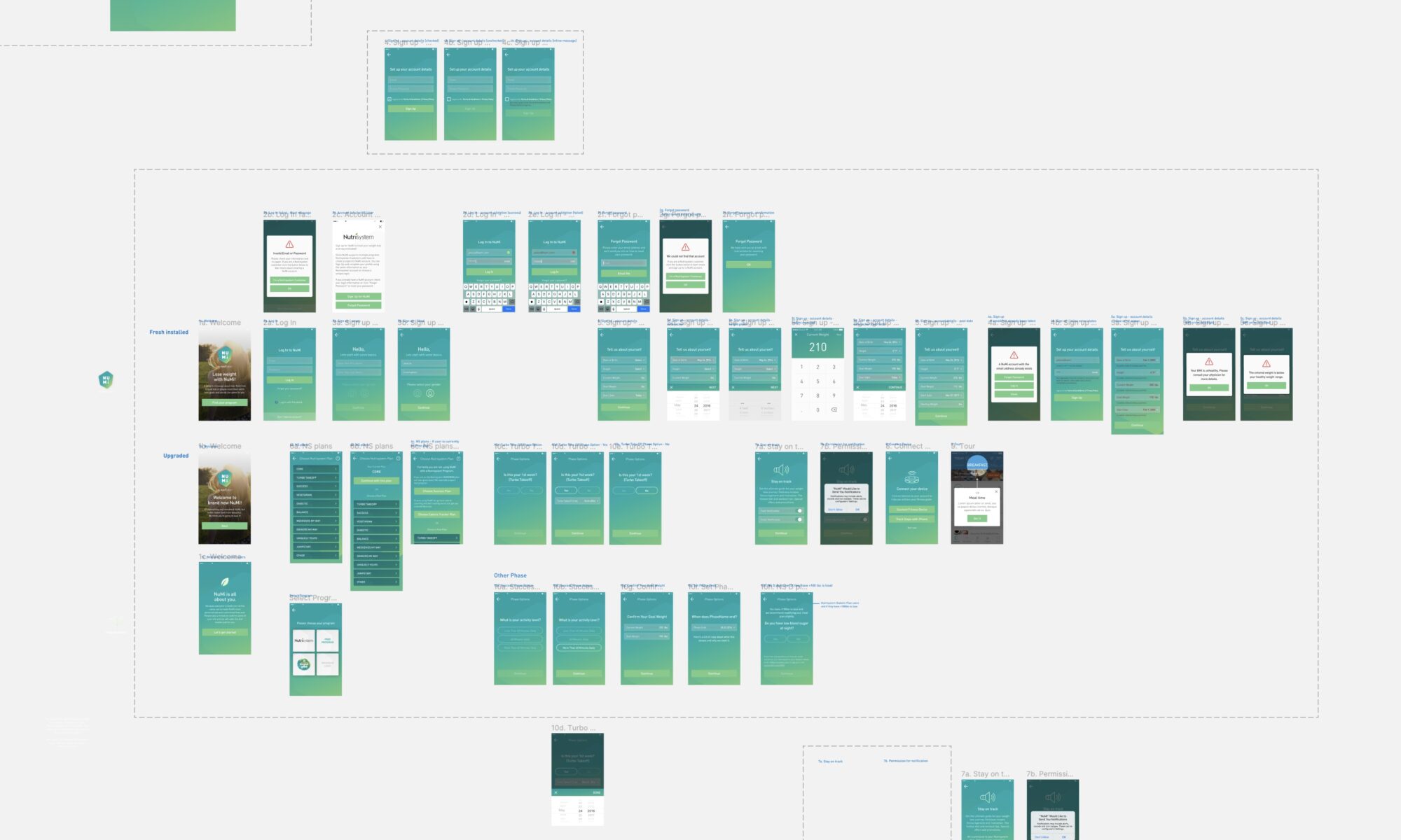
We took a closer look at the existing screens, lining them up side by side and breaking them down into each "mini-flow" for a thorough examination.
Simplified Onboarding
The onboarding process was a tad tangled up and sprawling. So, we streamlined things – trimmed down the screens and options, making the app introduction much simpler and straight to the point.
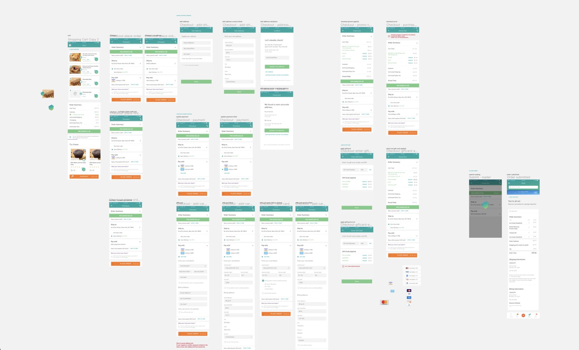
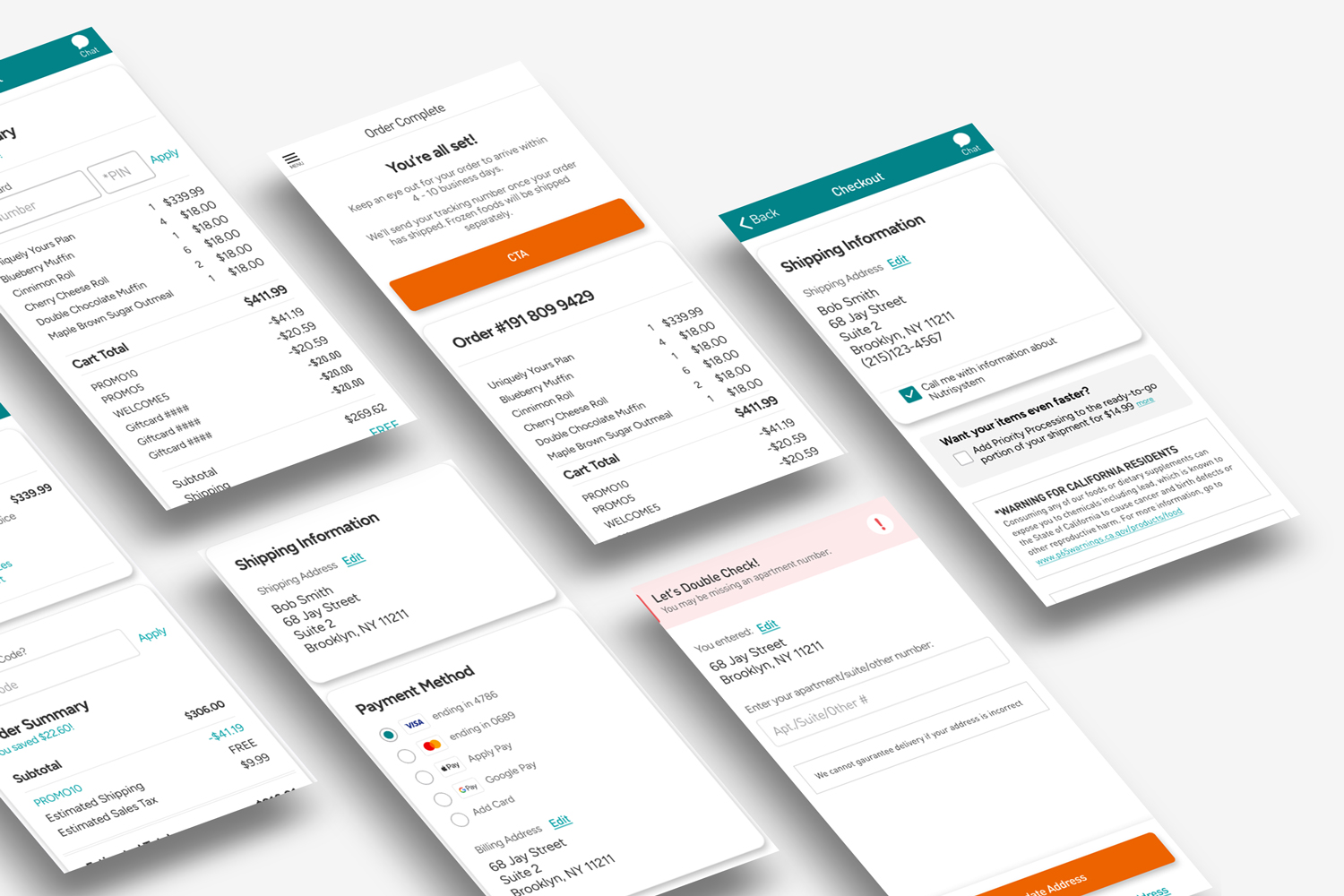
Refined Checkout
Enhancing the checkout process required meticulous attention to detail, particularly in separating sections and refining the typography hierarchy. Our strategic updates significantly improved legibility and comprehension, optimizing the overall user experience.
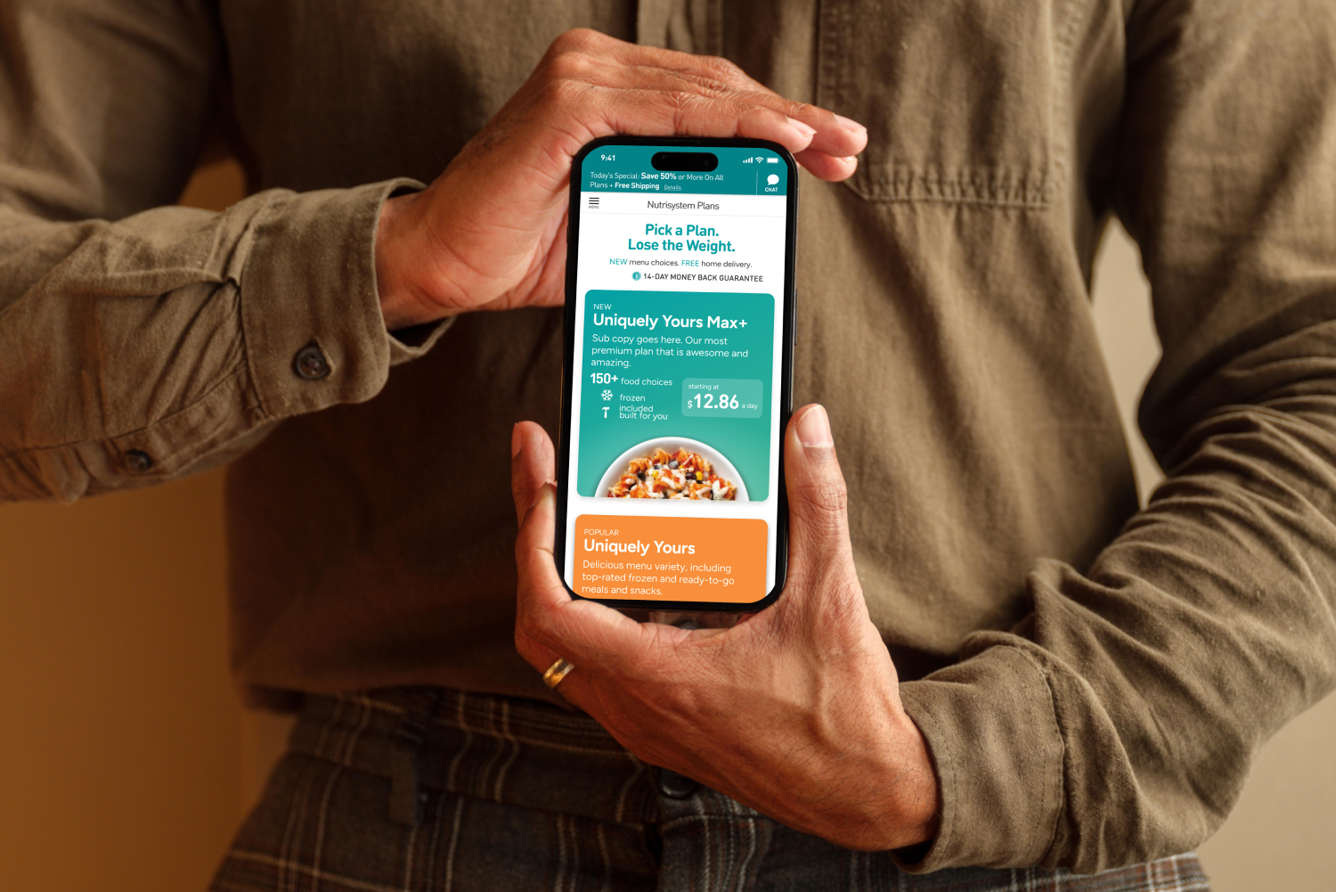
Shop Plans
Following the successful updates to the app components mentioned earlier, our focus shifted towards integrating Nutrisystem's future design system. We introduced additional colors to infuse a fresh vibe and incorporated drop shadows to add depth, enhancing the overall visual appeal.
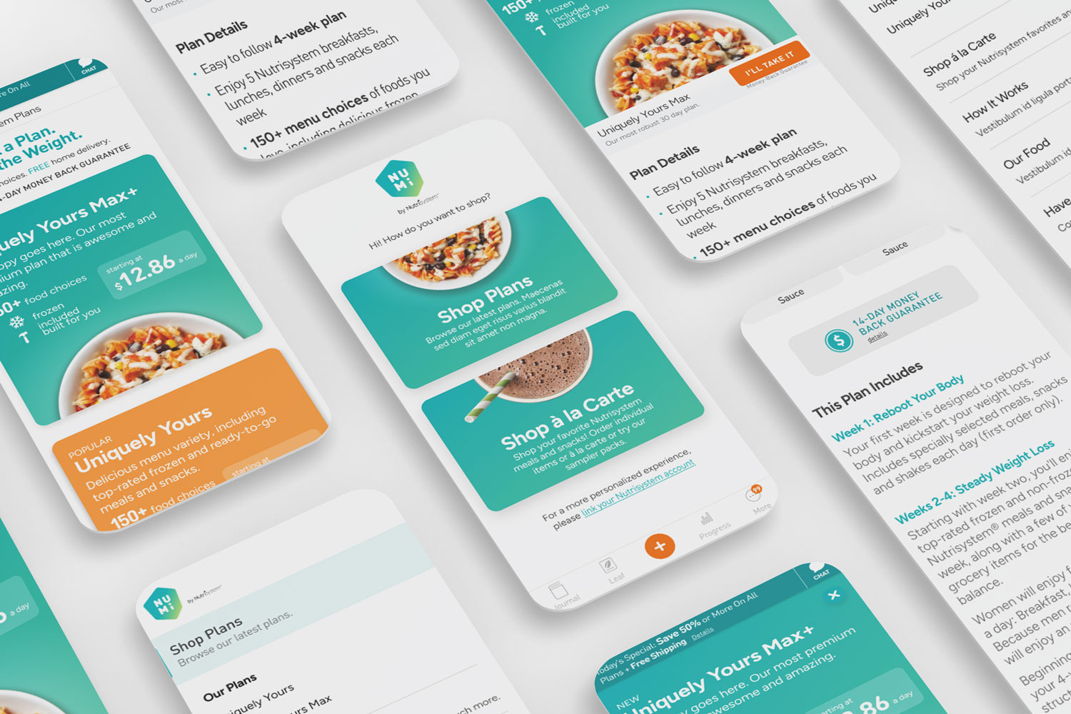
We did our best to remove the app's pain points and create an experience that is simple and thoughtful. Highlighting the brand colors allowed us to differentiate content sections while clear typography hierarchy makes sure everything is legible.