The Challenge
AIM partners with pharmaceutical, biotech, and life science companies to design and build efficient, high-performing supply chains. With extensive industry expertise and a proven track record of success, their brand identity, however, failed to reflect these strengths. It appeared outdated and lacked consistency. To align with their professionalism, innovation, and exceptional value, AIM required a refreshed brand identity. Additionally, they needed to revamp their existing marketing materials and create new, cohesive assets that would accurately showcase their capabilities and vision.
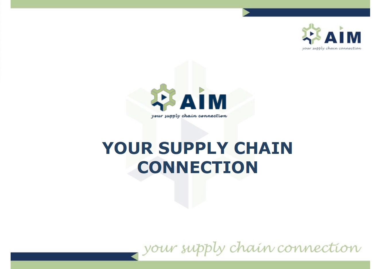
We Gave Their Logo a Fresh and Modern Look
AIM had used their old logo for six years, and while it held some recognition among existing customers, it failed to stand out in a competitive market. They wanted to preserve the essence of their brand while making it more appealing and relevant to their target audience. Particularly fond of the "wheel" element, which represented their broad service offerings and dynamic approach, they sought a way to enhance it. Instead of a complete redesign, we opted for a subtle yet impactful refresh. We refined the wheel's shape and color, giving it a sleeker, more vibrant look. Additionally, we updated the typography with a modern, legible font. The result was a refreshed logo that better captured their brand's personality and values, while drawing more attention and resonating with a wider audience.
Out With the Old
In With the New
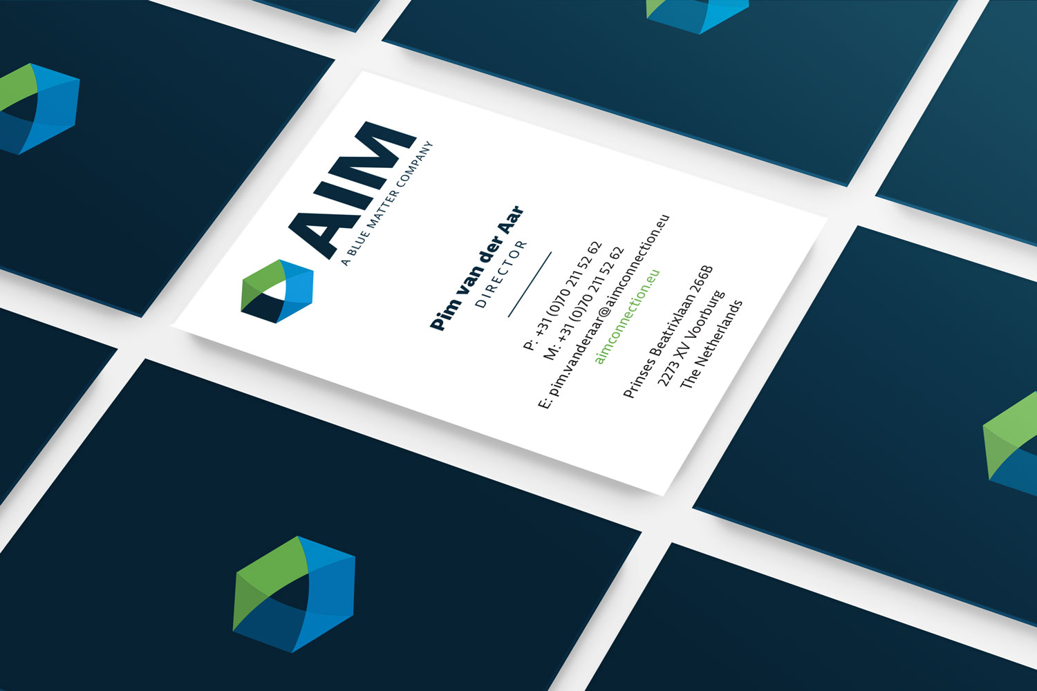
Modern Business Card Designs
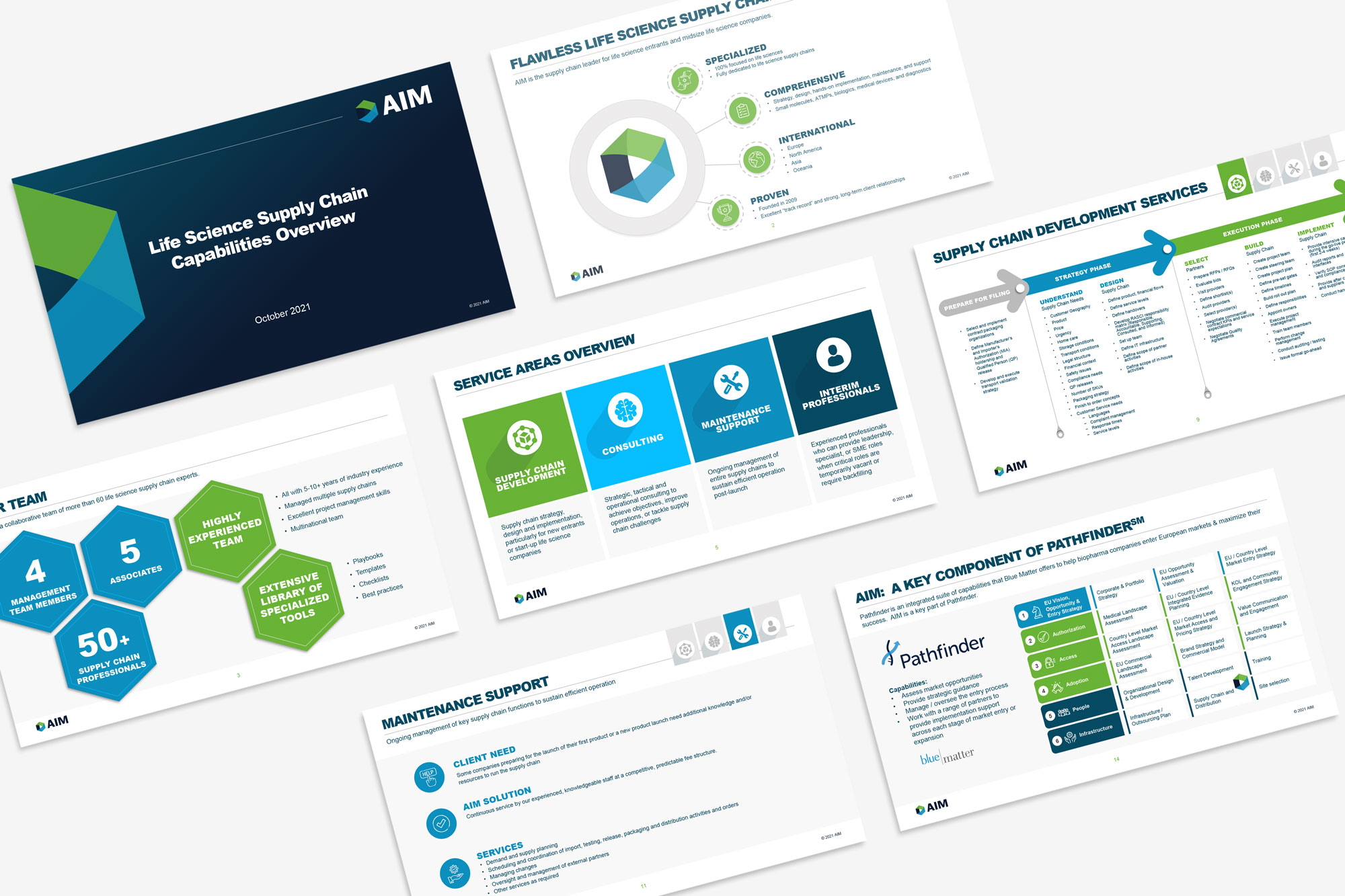
Continuing the Brand Evolution with Revamped PowerPoint Templates
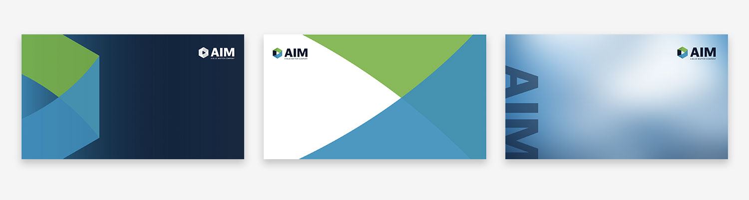
Branded Video Call Backgrounds
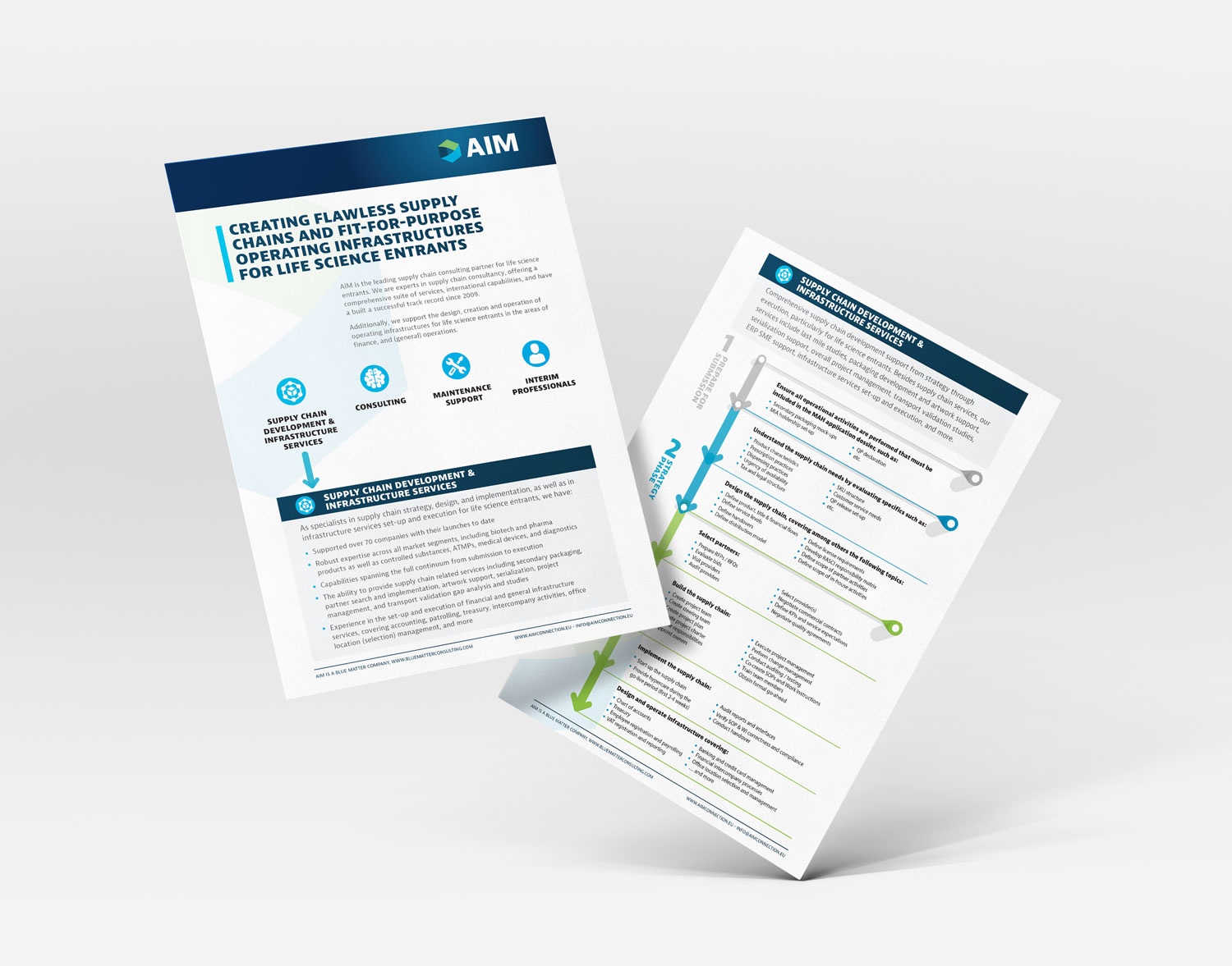
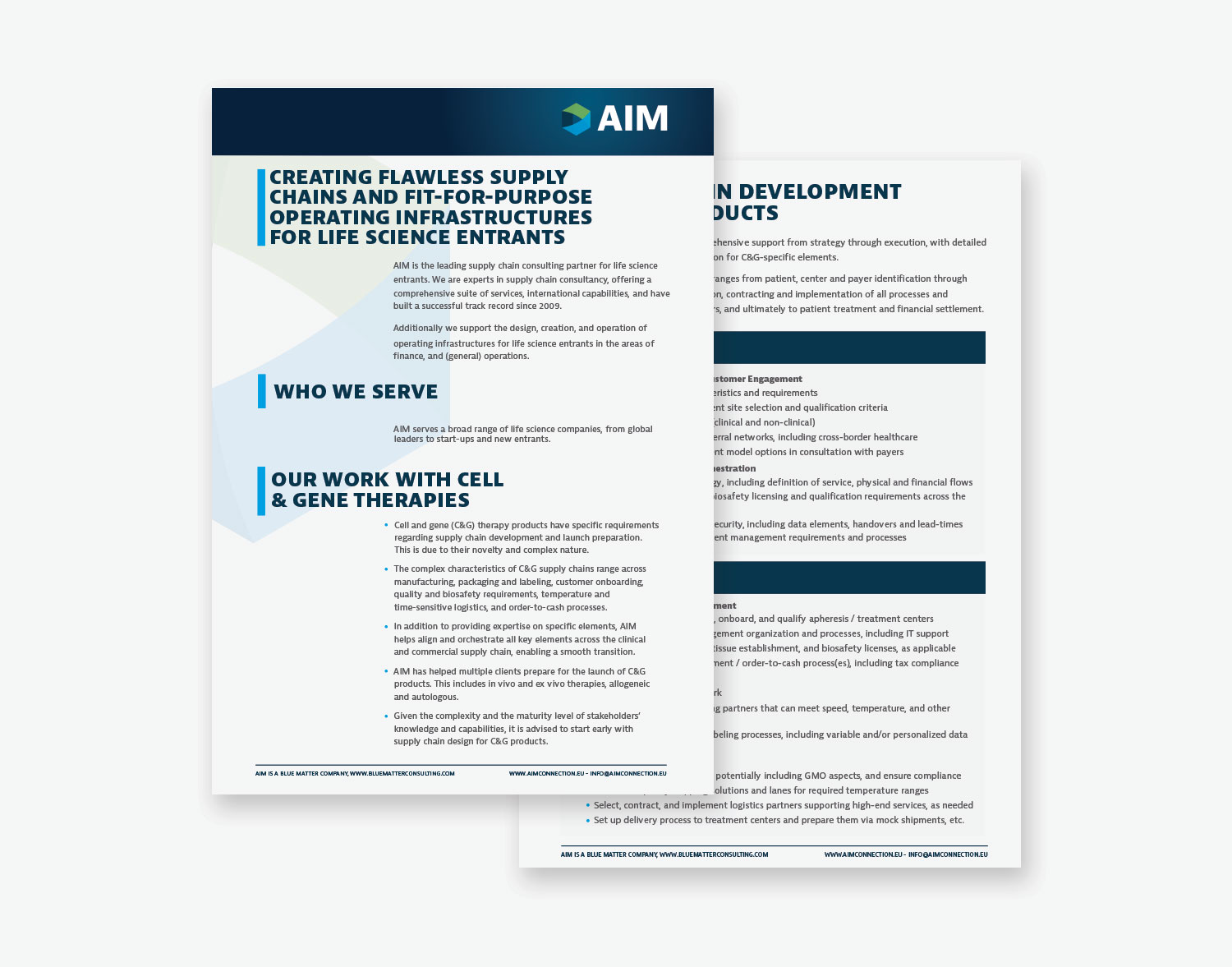
Sleek Whitepaper Page Designs for Clear Communication
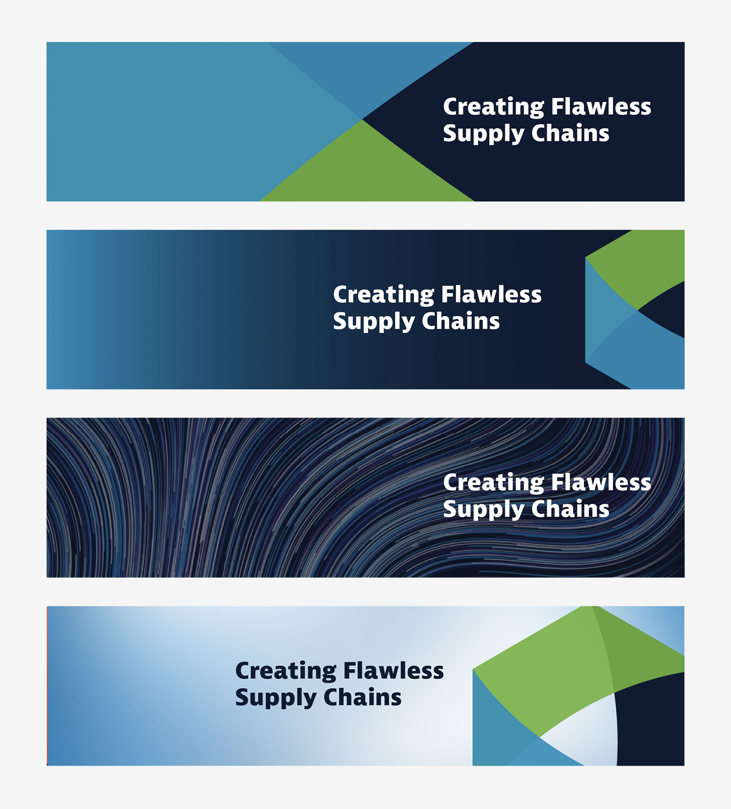
Fresh LinkedIn Banner Designs
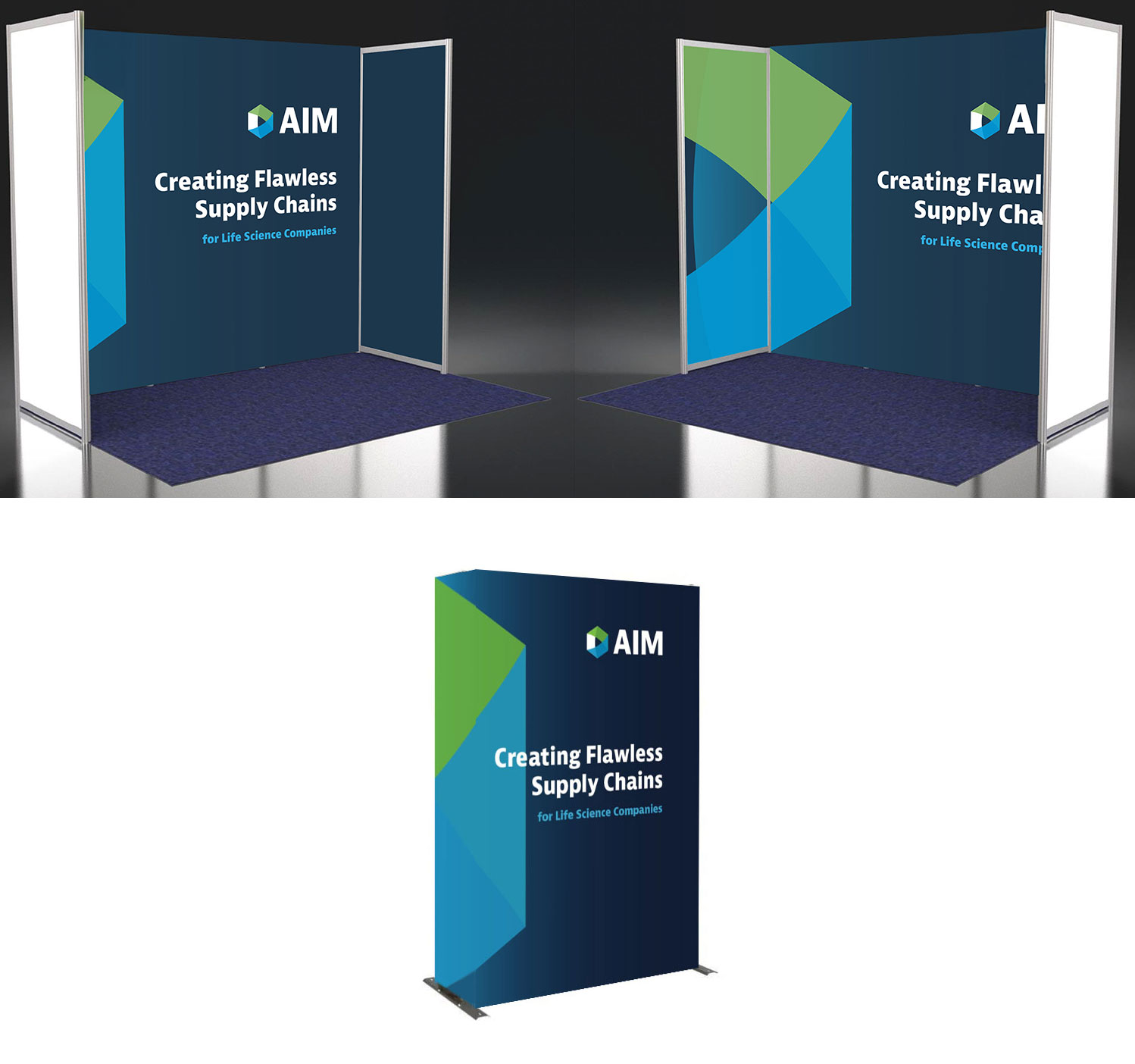
Standing Out With Engaging Tradeshow Booth Designs
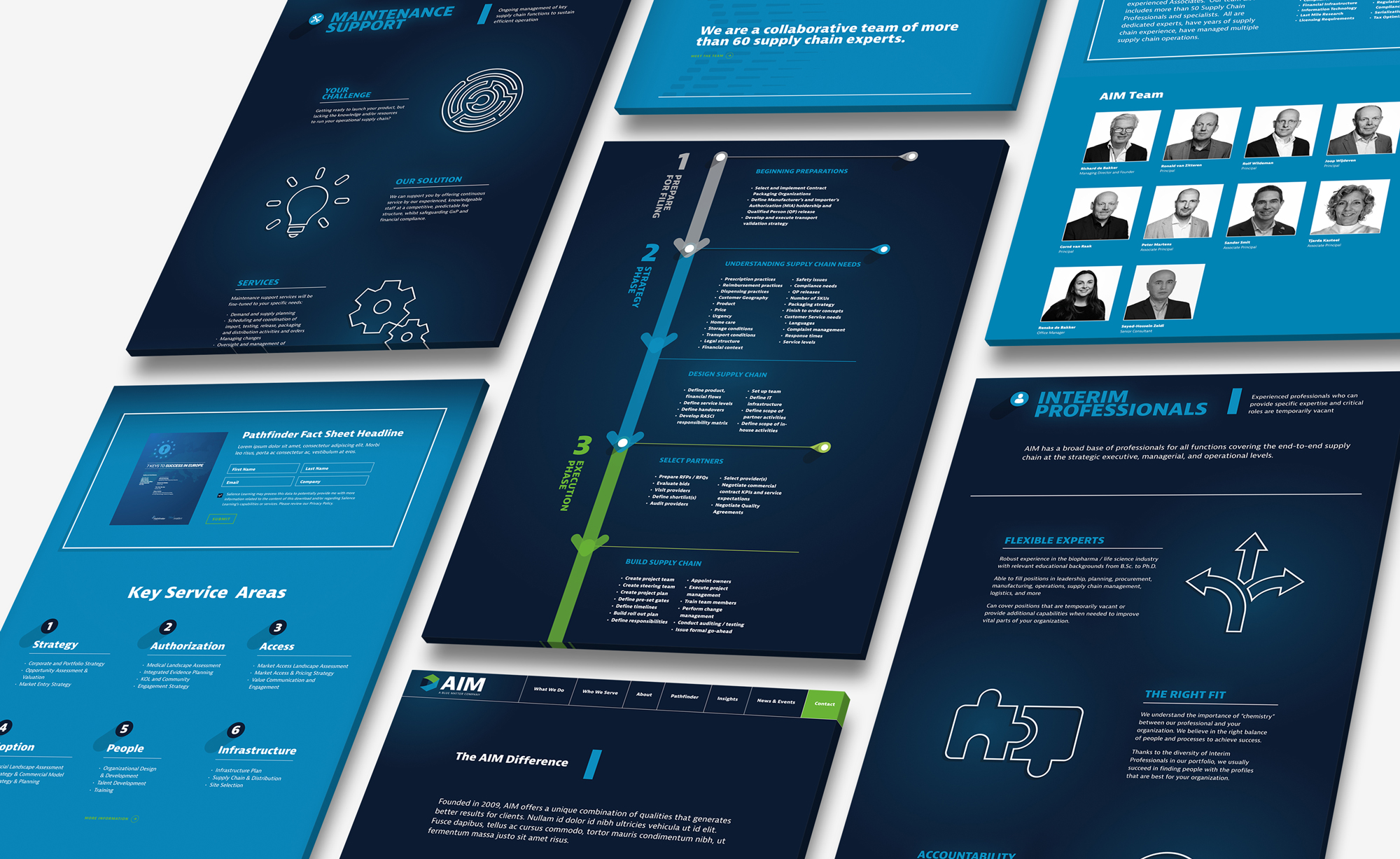
A Sophisticated, Modern Website Design
We leveraged AIM's brand colors to craft a sophisticated, dark theme, while adding visual depth by incorporating a smooth, dynamic background color transition as users scrolled through the pages. Subtle animations were strategically used to emphasize key content and guide the user’s attention to the next section. Thoughtful typography and ample whitespace ensured that the copy was not only easy to read but also clear and engaging.