At King Design, we’ve been using Figma for many years now. We absolutely love it and find it one of the best tools ever created for web design and development. How simple and intuitive it is to use is one thing but adding the collaborative aspect to it (for our team and our clients) was an absolute game changer. The community side is another element that shouldn’t be overlooked. There are so many great features created by the Figma team but also additional features that community members share through plugins. Here’s a round up our favorite Figma plugins at this time.
Beautiful Shadows (and SmoothShadow)
Shadows in web design are super common but have you ever noticed that some just look better than others? When more than one drop shadow is applied to an element, you can smooth it out and make it look more natural. Beautiful Shadows and SmoothShadow are two plugins I use quite often. Beautiful Shadows has an advantage that you can change the angle of the light source while SmoothShadow has an advantage in a more granular rendering of the shadow. Pro tip: use a very dark color version of whatever background color the shadow is falling on, it shouldn’t always just be black!

Component Replacer
Design Systems are super helpful but can be a little frustrating sometimes. Frequently, we find ourselves needing to simply swap out a component block for another. We’ve tried some of the tricks Figma recommends but we currently can’t get any to work as simply as Component Replacer does. Click on the block you want to swap out, click on the new component you want swapped in. Done.

Contrast (and Stark)
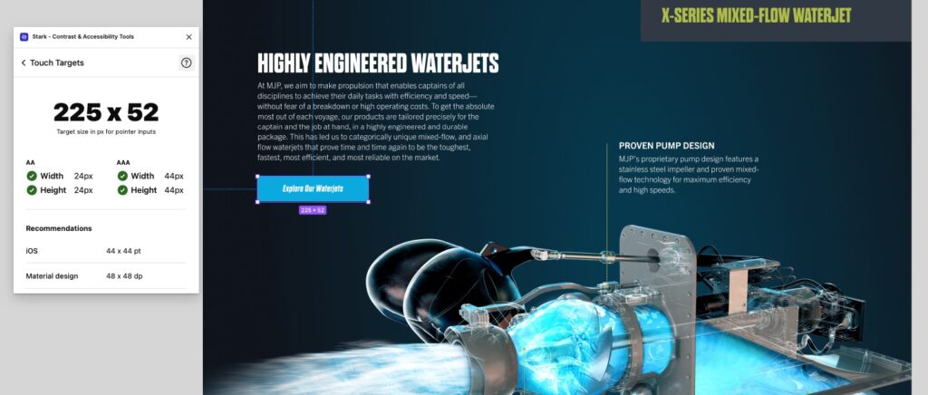
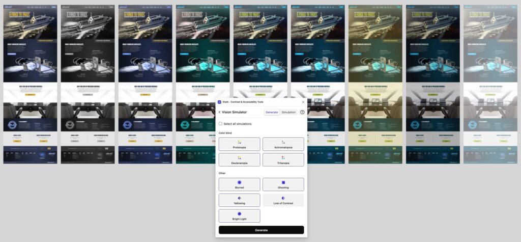
As a web designer, making the content easily digestible and legible is paramount. Accessibility is a major aspect of web design that shouldn’t be overlooked. To help with making sure text is easy to read, we like to use Contrast. It quickly shows which level of accessibility your color combination passes or fails with. If you’d like even more accessibility testing tools, Stark is a great one. Other than contrast, you can also test if click/touch elements are a good size and what your design would like with visual impairments!


Iconify
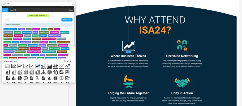
What’s a website without icons? They’re needed on just about every site and there are a billion different icon packs out there. Ideally, you would stick to one pack but sometimes you need to mix and match (they better look similar though) to represent different content. Iconify lets you search multiple packs and insert icons right into your design!

Remove BG
We do most of our image editing inside Photoshop but sometimes you just need to quickly remove the background of an image that’s already in your design. Thank you Remove BG for making our dreams come true!

Try Them Out!
These 5 Figma plugins are a real life-saver for a web designer. If you haven’t used them yet, definitely add them to your Figma account! And if you need some help with your website design, let us know!