Weaver's Way
the challenge
Weaver's Way approached us with a functional, but uninspired, draft of their new website. While the underlying structure was in place, the design lacked the flair and uniqueness they envisioned. Inspired by their mission, and the dynamic and visually engaging elements of the store itself, our team focused on transforming their existing framework into a site that truly reflected their goals, imbuing it with the impactful design and distinct personality they desired.
Our first order of business was to design navigation that was organized and more user friendly.
Before: Crowded and confusing.
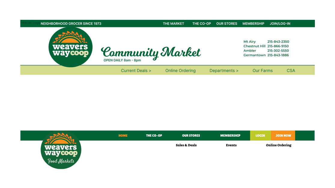
After: Cleaned up, modern, straightforward.
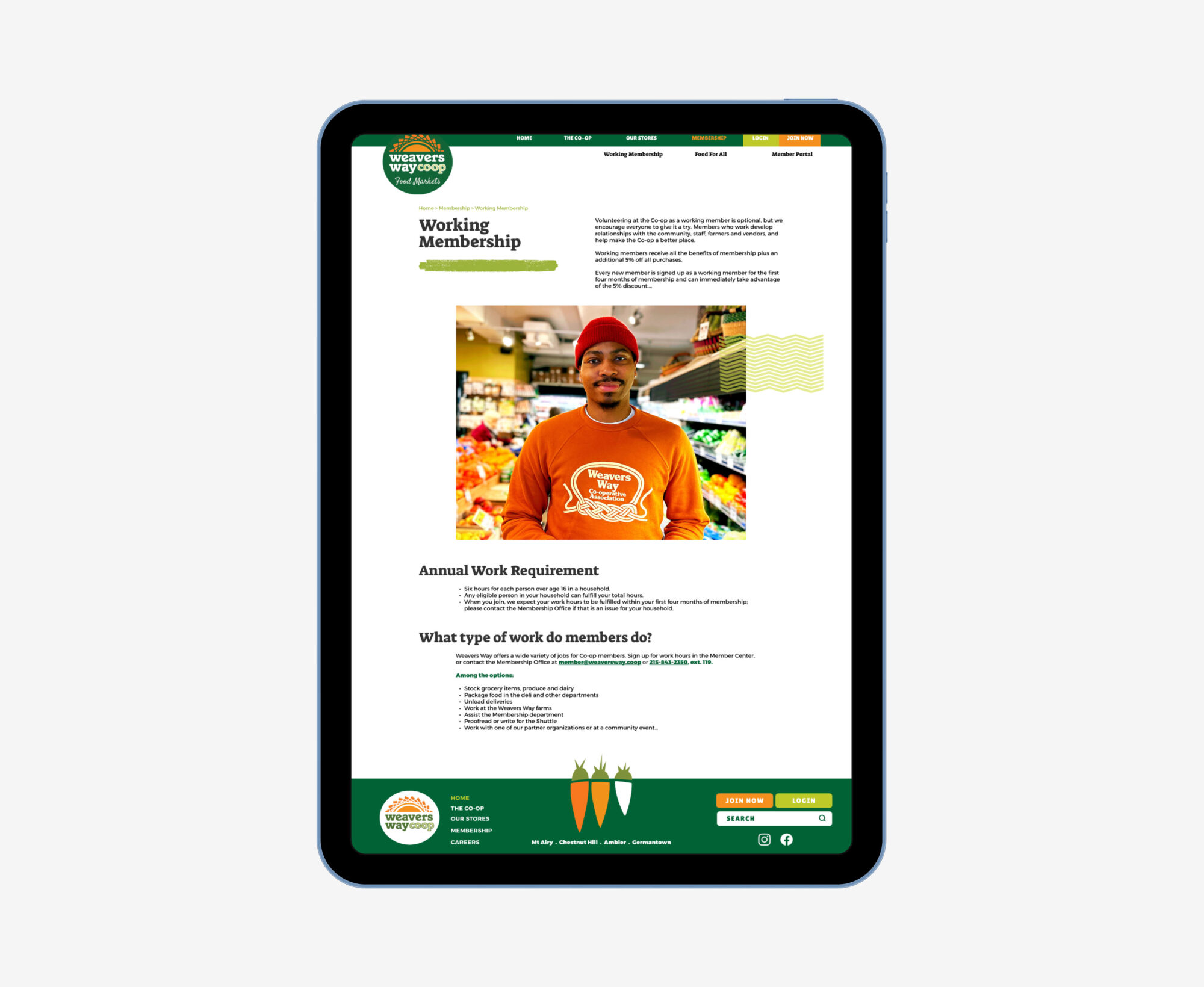
We then created easy to understand content organization and hierarchy with fonts and flare that was more reflective of the store.


We leveraged print assets to make the website more consistent with other store marketing.


We helped with suggestions for photography styles and use.


Creating a more modern site that is easy to understand and fun to go through- just like the stores!