In the ever-changing world of the internet, deciding when to give your website a makeover is a common puzzle for businesses. Don’t worry, we’ve got your back! This blog post is all about helping you figure out the perfect time to spruce up your website.
Staying Fresh with Design
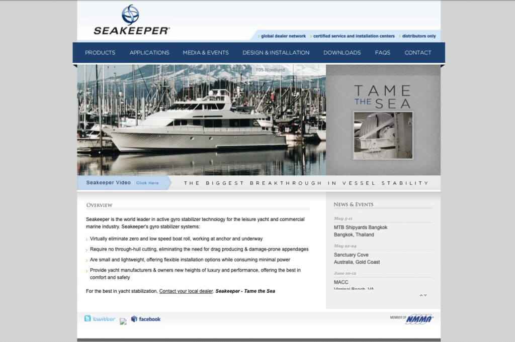
You know your website needs a facelift when it starts feeling like a blast from the past. If it looks like it’s stuck in the 90s, it’s a clear sign that a redesign is overdue. Too many colors, fonts, and images that belong to a bygone era can make your site less appealing to visitors.

Need for Speed
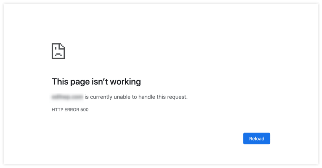
Nobody has the patience for a slow-loading website these days. If your site takes forever to load, it’s waving a big red flag saying, “Revamp me, please!” Shorter attention spans mean quicker loading times are a must. Things like huge image files, tons of plugins, or outdated code could be the culprits behind the sluggishness.

Safety First
Think of your website’s security like a fortress–if it’s not strong, your business’s reputation is at risk. If your site’s security measures are questionable, it’s high time for a redesign. Better security not only shields your brand but also builds trust with your customers in the face of online threats.

Easy-Peasy Content Management
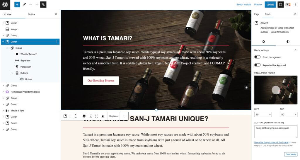
When handling your website feels like a chore, it’s a strong hint that a redesign is calling your name. The way your Content Management System (CMS) works can either make your life easier or give you a headache. A user-friendly CMS can make updating your content a breeze and keep your site looking fresh.

Unlock Conversion Magic
Let’s get real: your website should be a wizard at turning visitors into customers or leads. If your current design isn’t working its magic in that department, a redesign is a must. Crafting a design that’s all about guiding visitors towards taking action is the key to boosting engagement and getting results.

As You Can See
By soaking in these insights, you’ll be armed with a better sense of when it’s time to roll up your sleeves and give your website a major boost. With this knowledge in your back pocket, you’re all set to dive into the exciting journey of giving your digital presence a fabulous makeover. And if you’d like our help with that website redesign, give us a call!